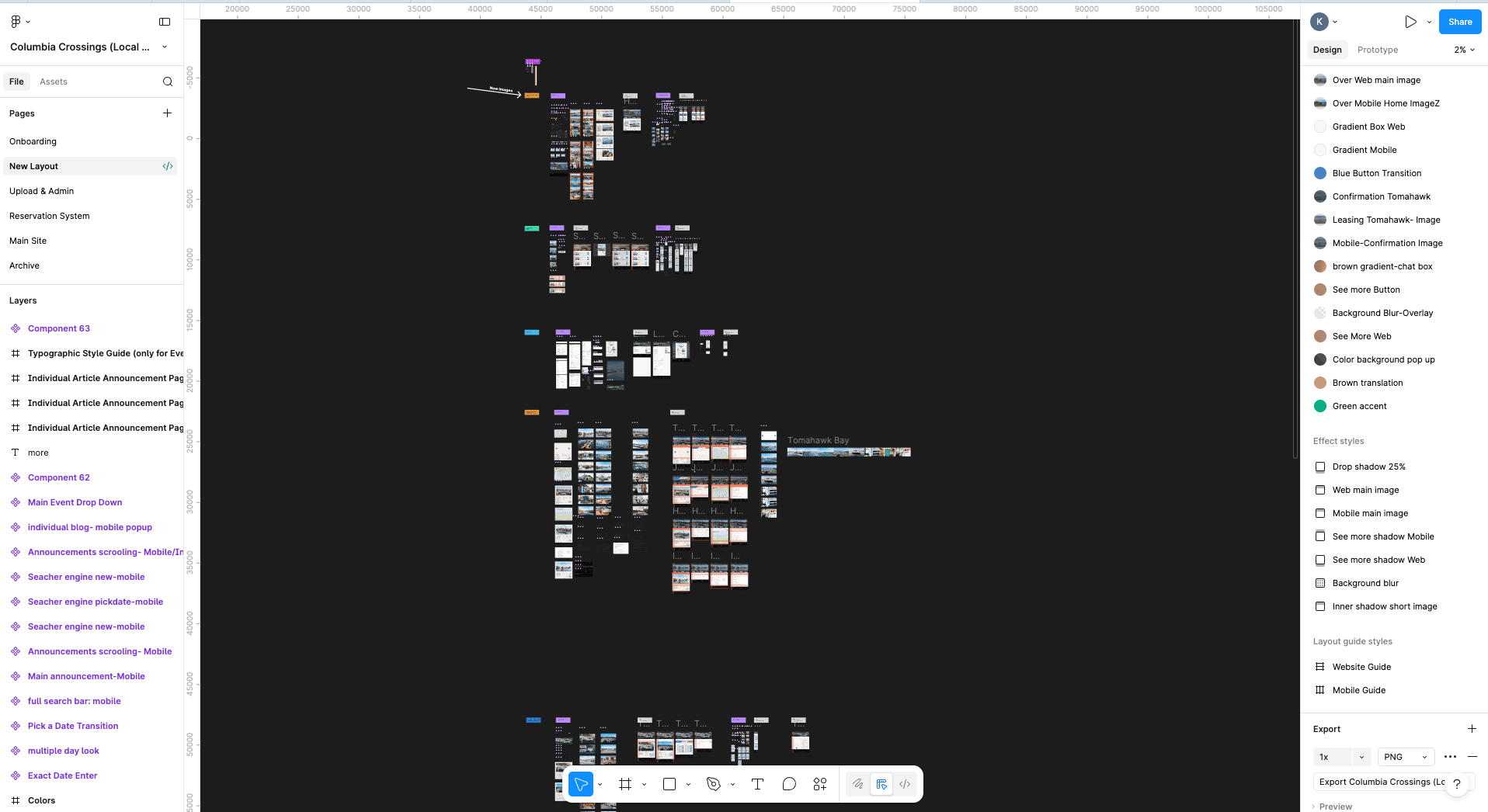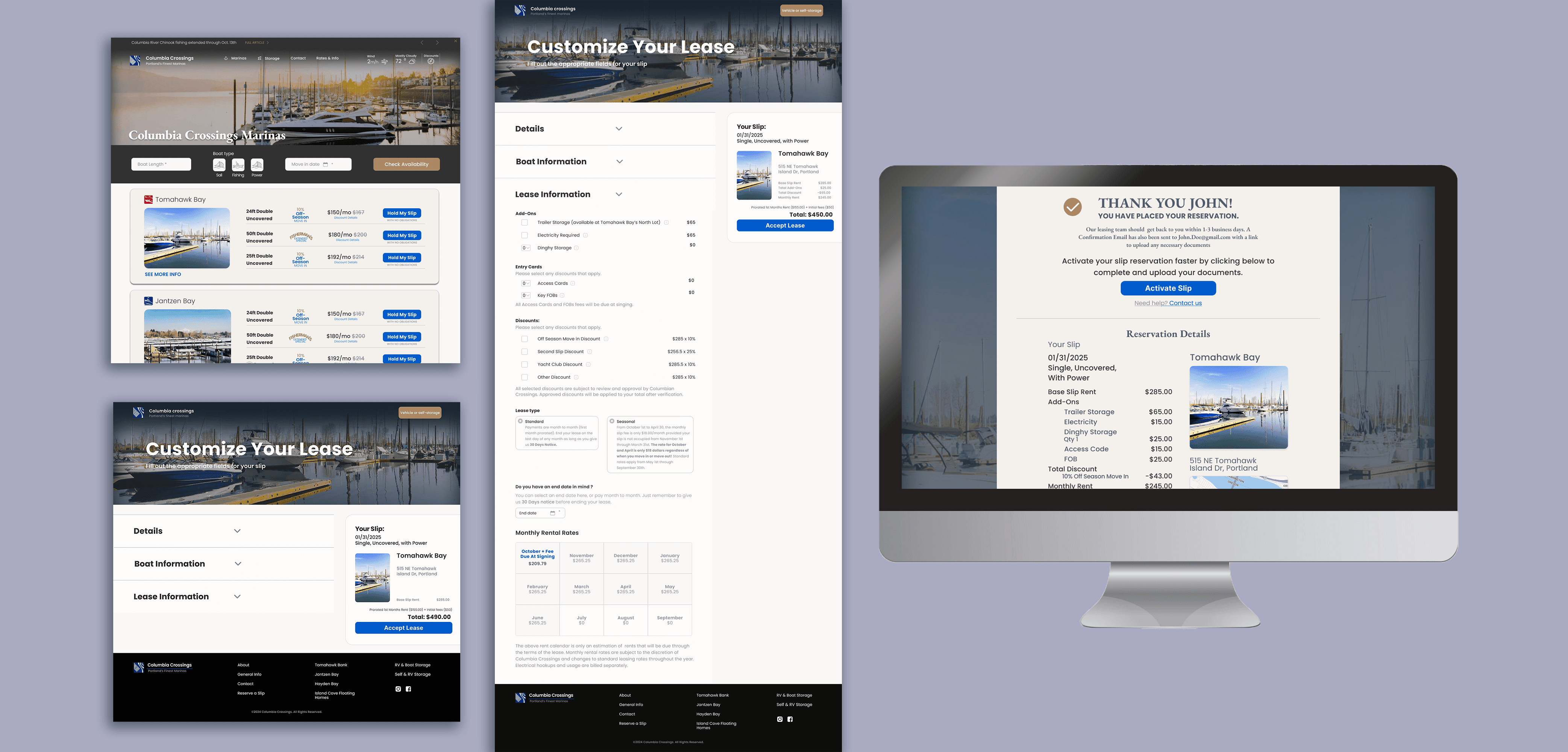
Website Redesign. A 12% revenue increase starts with a search bar that actually makes sense.

Three marina locations, one cluttered website, and a booking flow that was losing people before they even searched. I came in as the sole designer and rebuilt it from the ground up, UX and graphic design both.

Role

Sole UX/UI Designer

Client

Columbia Crossings Marinas

Timeline

Aug 2024 – Oct 2025

Tools

Figma, Adobe Suite
Overview

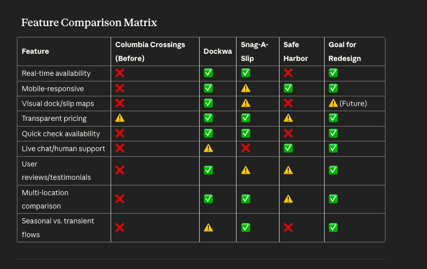
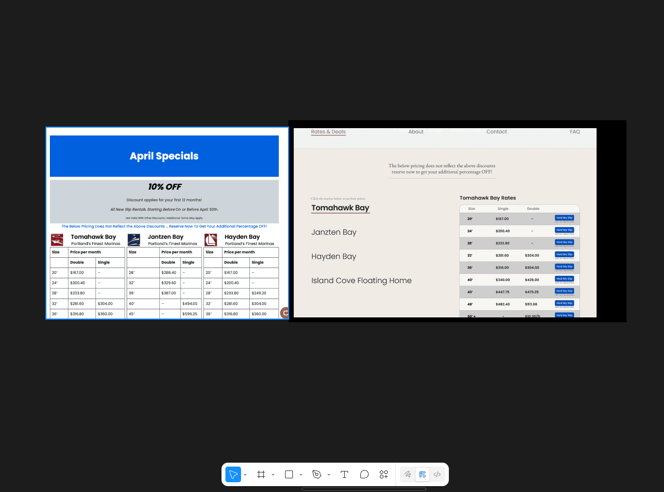
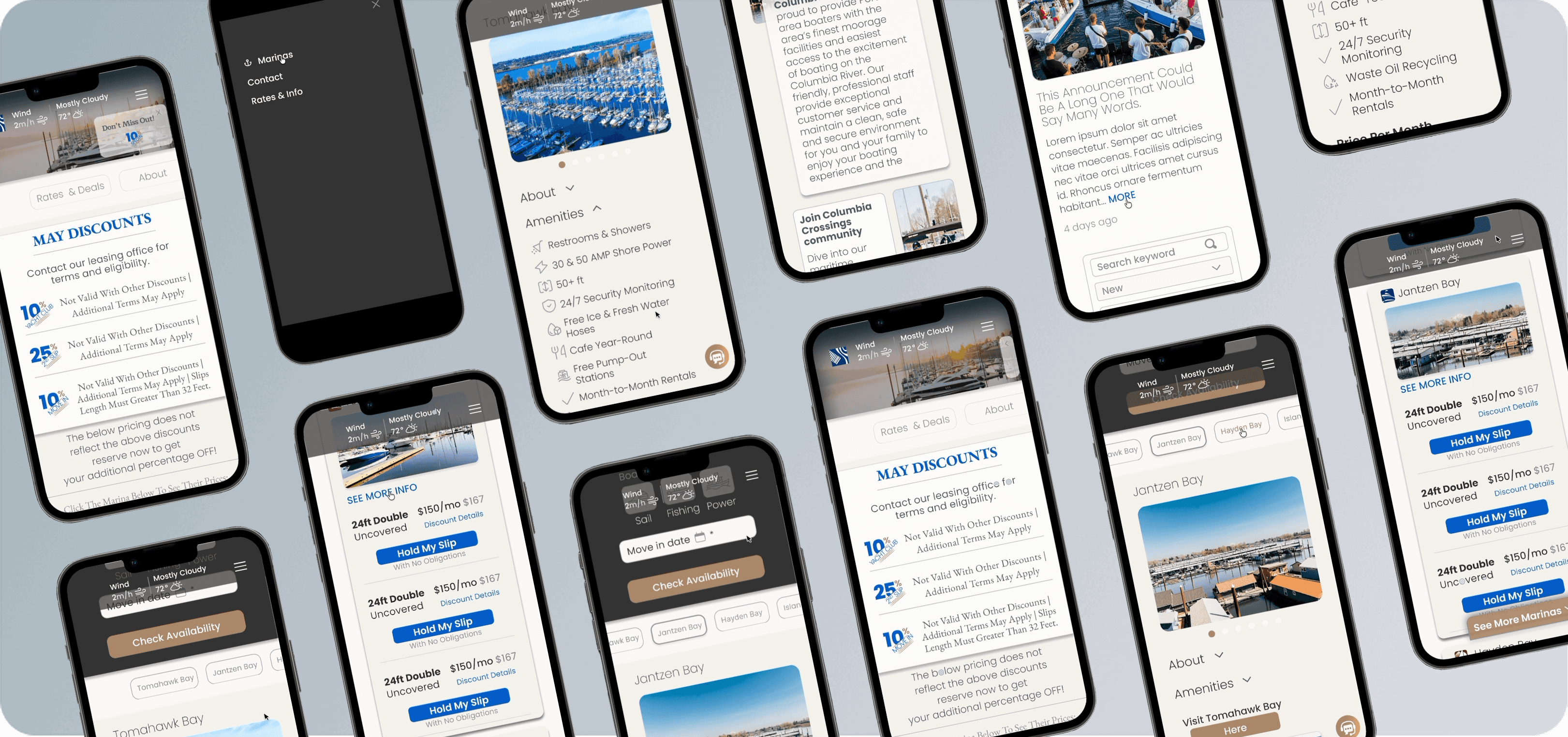
Columbia Crossings runs three marinas in Portland, Jantzen Bay, Tomahawk Bay, and Hayden Bay, plus two storage unit locations. Their existing website was making it hard for boaters to find slips, check availability, and complete reservations, especially on mobile. The experience was overwhelming, visually outdated, and losing people before they could even get to the booking step.

My goal: I came in as the sole designer to fix it. The focus was the marina side, the storage unit experience is still in progress. The goal was simple: make it easy to find a slip, understand what is available, and get through the reservation process without friction, on any device.

Columbia Crossings runs three marinas in Portland, Jantzen Bay, Tomahawk Bay, and Hayden Bay, plus two storage unit locations. Their existing website was making it hard for boaters to find slips, check availability, and complete reservations, especially on mobile. The experience was overwhelming, visually outdated, and losing people before they could even get to the booking step.

My goal: I came in as the sole designer to fix it. The focus was the marina side, the storage unit experience is still in progress. The goal was simple: make it easy to find a slip, understand what is available, and get through the reservation process without friction, on any device.

The Problem

The site was not mobile friendly, even though 60%+ of users were coming in on mobile.

Too much text, no clear hierarchy, users did not know where to look first.

People were dropping off before they could even complete a reservation, or just showing up in person instead.

The navigation was confusing and the design felt outdated, which made it hard to trust
the site

My Process

  • 1

    Discovery

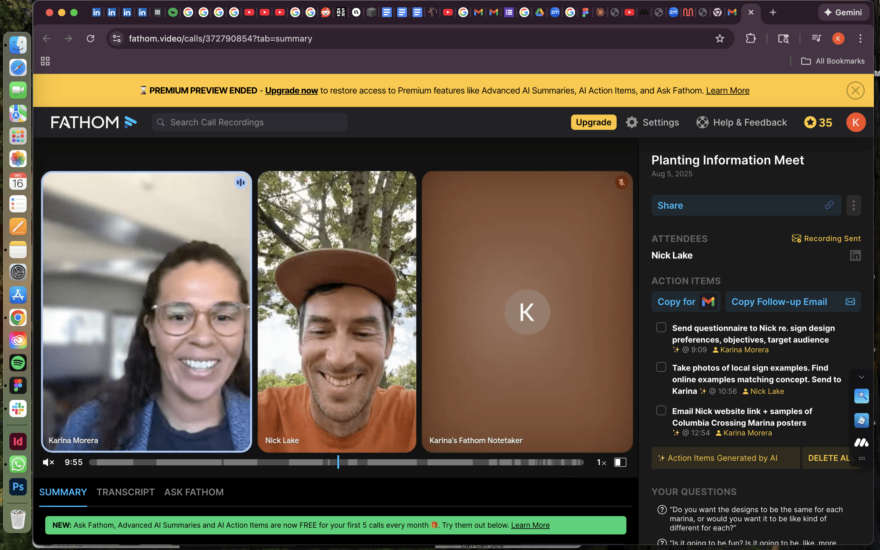
    Defined scope and pain points from stakeholder conversations.

  • 2

    Information Architecture

    Reorganized navigation and content hierarchy

  • 3

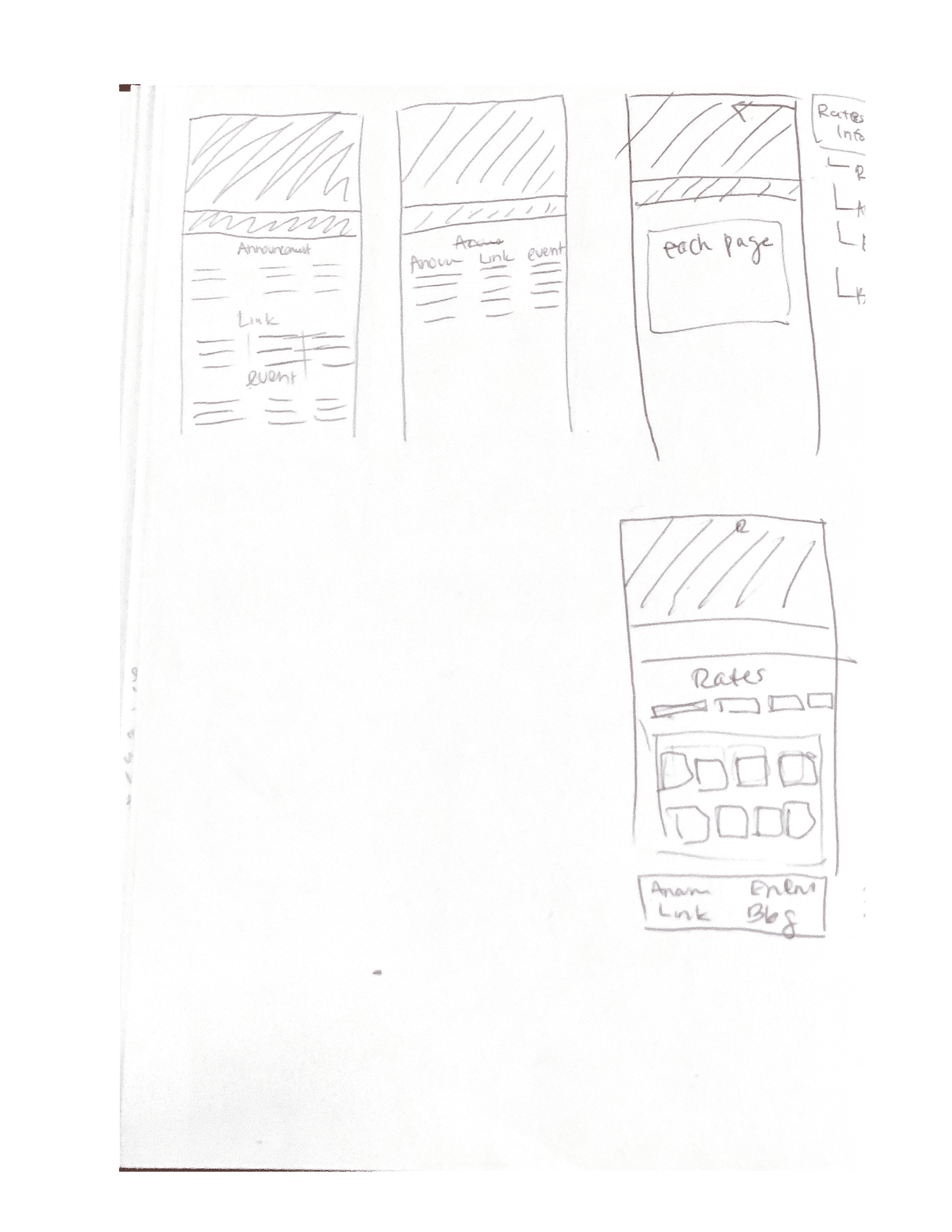
    Wireframes

    Iterated low- and high-fidelity
    versions

  • 4

    UI Design

    Modular components and visual patterns

  • 5

    Iterations

    Refined, adjusted, refined again based on feedback.

  • 6

    Handoff

    Collaborated with developers

Results

30-50%

Could book on mobile if flow was simple

55+

Age of many
costumers

3

Marina
locations

4

User types
identified

Design Principles

Real-time transparency

Show availability immediately

Progressive disclosure

Display only relevant fields for each user type

Design layout for mobile

Make booking simple on small screens

Human guidance

Clear messaging and access to real staff
The Problem

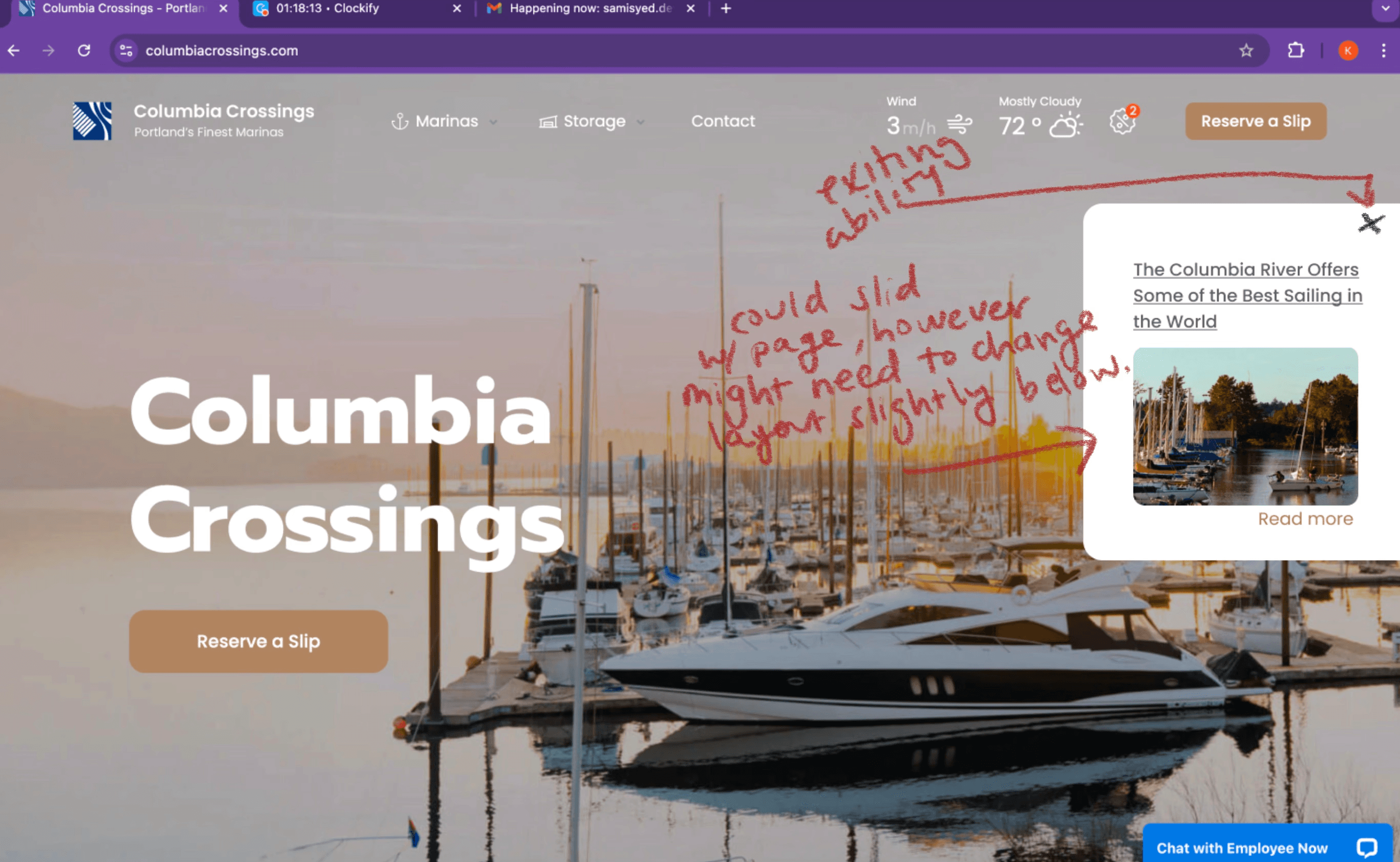
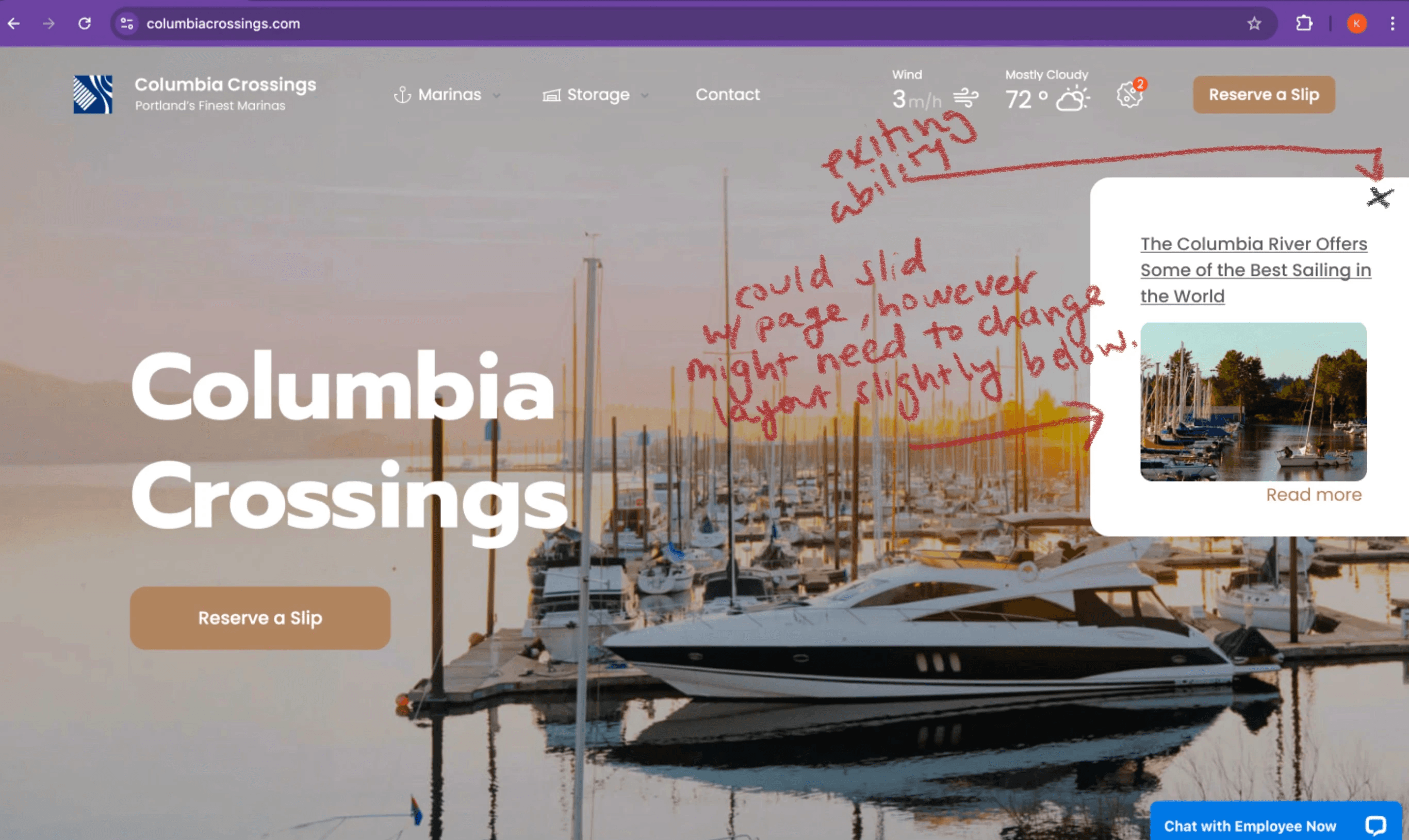
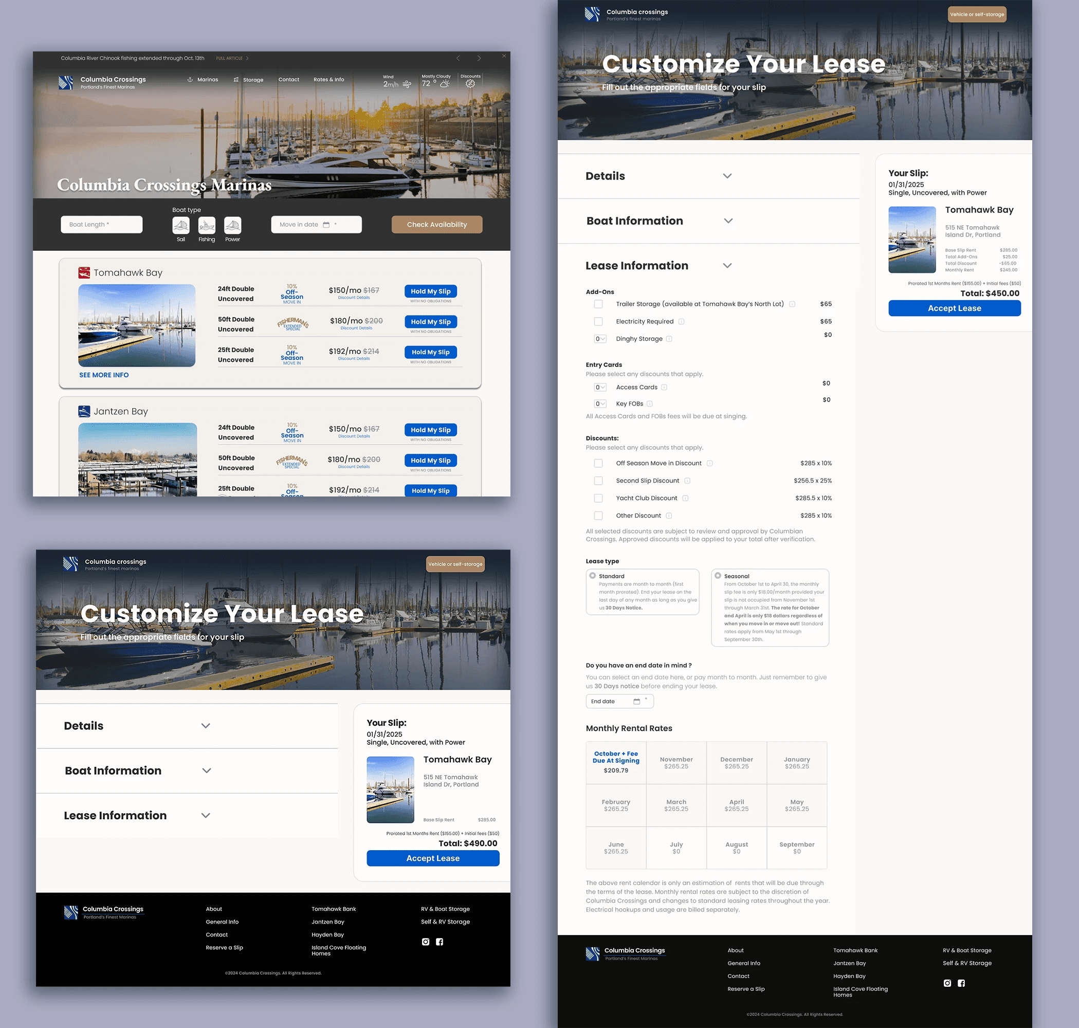
Announcement Banner

Rotating top banner for events/news, toggleable with arrows and clickable for full articles

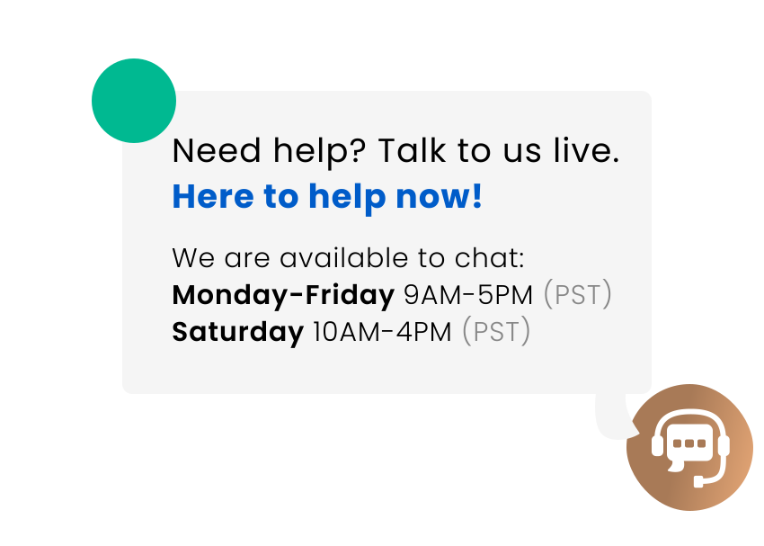
Messaging/Chat Box

Clear indicator showing live
staff availability (not bots) for
human guidance

Collapsible Panels

Long-form leasing content
organized in expandable
sections to reduce overwhelm

Check Availability Bar

Quick-entry slip search with
minimal inputs, plus full marina browsing below

Modular Slip Cards

Cards with "more details,"
discounts, and location info,
plus auto-scroll functionality

Pricing Sidebar

Persistent panel showing cost,
add-ons, and discounts
throughout booking flow

Key UX & UI Decisions

Announcement Banner

Rotating top banner for events/news, toggleable with arrows and clickable for full articles

Check Availability Bar

Quick-entry slip search with
minimal inputs, plus full marina browsing below

Messaging/Chat Box

Clear indicator showing live
staff availability (not bots) for
human guidance

Modular Slip Cards

Cards with "more details,"
discounts, and location info,
plus auto-scroll functionality

Collapsible Panels

Long-form leasing content
organized in expandable
sections to reduce overwhelm

Pricing Sidebar

Persistent panel showing cost,
add-ons, and discounts
throughout booking flow

Results

+12 %

Increase in positive reviews mentioning ease-of-use

Faster

More intuitive
booking flow

Mobile

Significantly improved for majority users
Reflections

Learnings

Backend constraints shaped design decisions (e.g., spacing increments for easier coding)

Early design systems save time and reduce rework

Simplifying complex content into digestible
UI is essential

Next Steps

Post-booking onboarding (emails, facility tours)

Explore dynamic pricing and mobile app features

Test community engagement features for boaters

Personal Growth

Strengthened Figma and component-based design skills

Improved collaboration with developers

Honed problem-solving as the solo designer managing a full redesign

When my team hired Karina to design our UI/UX, we were pleasantly surprised by her research-based approach to designing our site, checkout process, and customer portal. Her direction, Figma wireframes and keen eye for detail were invaluable in helping my team focus on coding.
Beyond creating beautiful, research-based designs for our platforms, Karina worked with me to make them modular and reusable across multiple sites. This allowed us to move quickly and reduce developer overhead without compromising the quality of our product

Sami Syed

Software Developer- Team Lead, Teutsch Partners/ Columbia Crossings

Let's Collaborate!

Reach out on LinkedIn or email — I’d love to chat.

Let's Collaborate!

Reach out on LinkedIn or email — I’d love to chat.

“ When my team hired Karina to design our UI/UX project, we were pleasantly surprised by her research-based approach to designing our site, checkout process, and customer portal. Her direction, Figma wireframes and keen eye for detail were invaluable in helping my team focus on coding.
Beyond creating beautiful, research-based designs for our platforms, Karina worked with me to make them modular and reusable across multiple sites. This allowed us to move quickly and reduce developer overhead without compromising the quality of our product”

Sami Syed

Software Developer- Team Lead, Teutsch Partners/ Columbia Crossings

Let's Collaborate!

Reach out on LinkedIn or email — I’d love to chat.

Create a free website with Framer, the website builder loved by startups, designers and agencies.